Snap Finance
Merchant Portal
The Ask
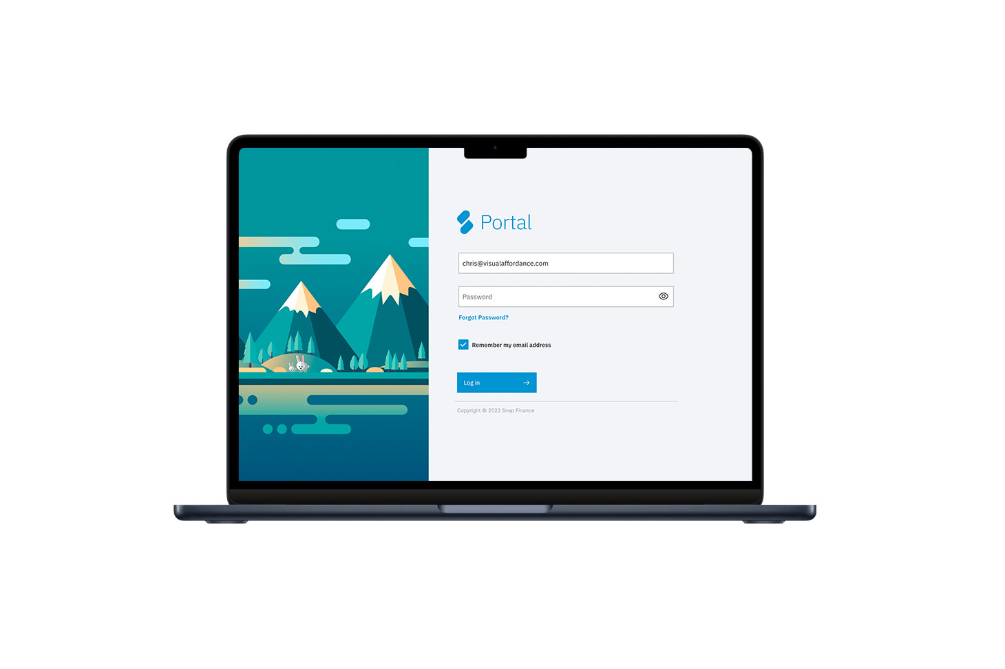
Create a proof of blue sky concept leveraging the IBM Carbon Design System and redesign the merchant portal experience.
The Research
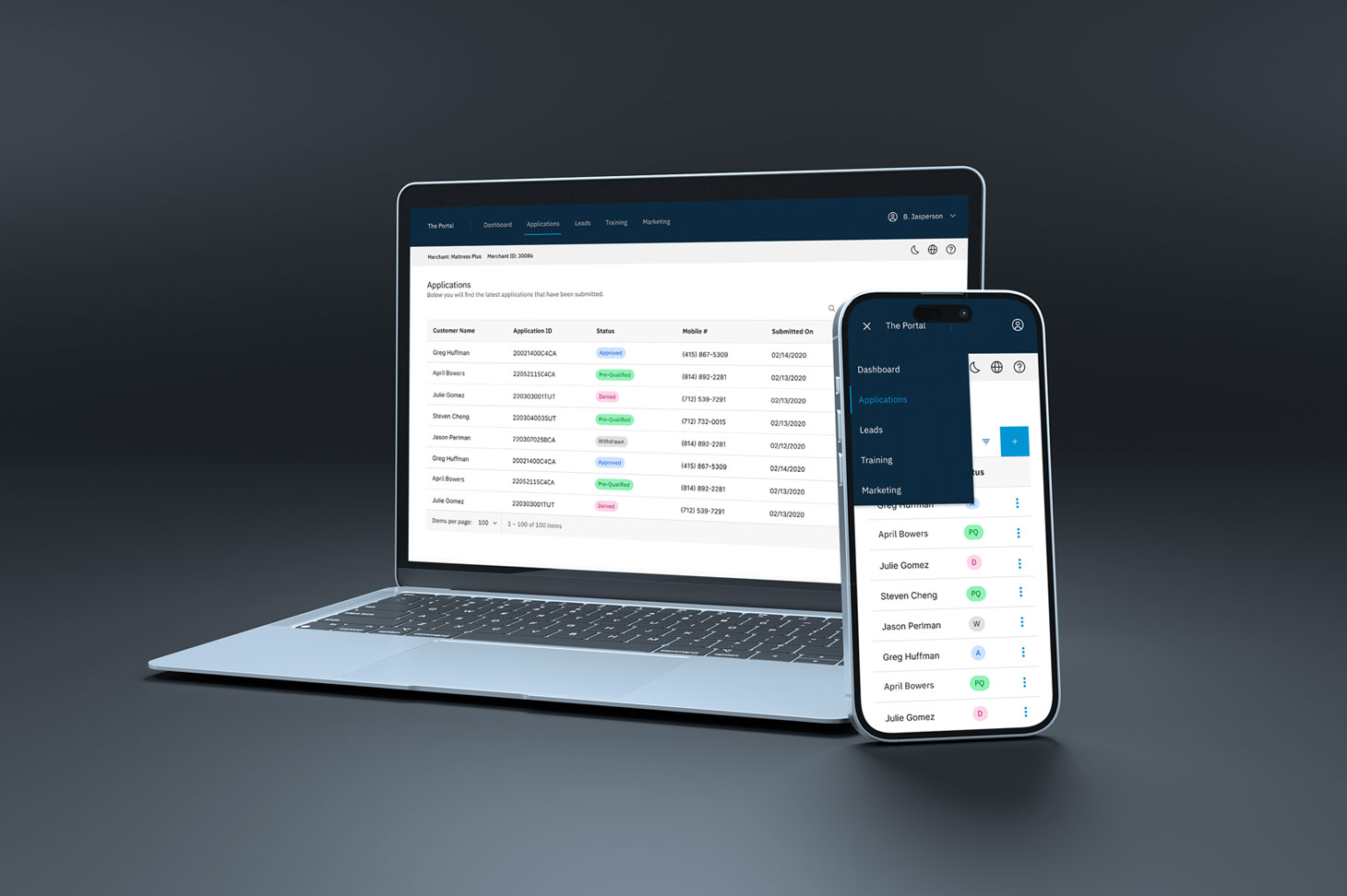
Already keen on the personas that utilize the merchant portal on a daily basis gave me a head start in understanding what is most relevant to those users. I knew submitting and reviewing application approvals were the top priority and so the inital screens were designed around that.
The Design
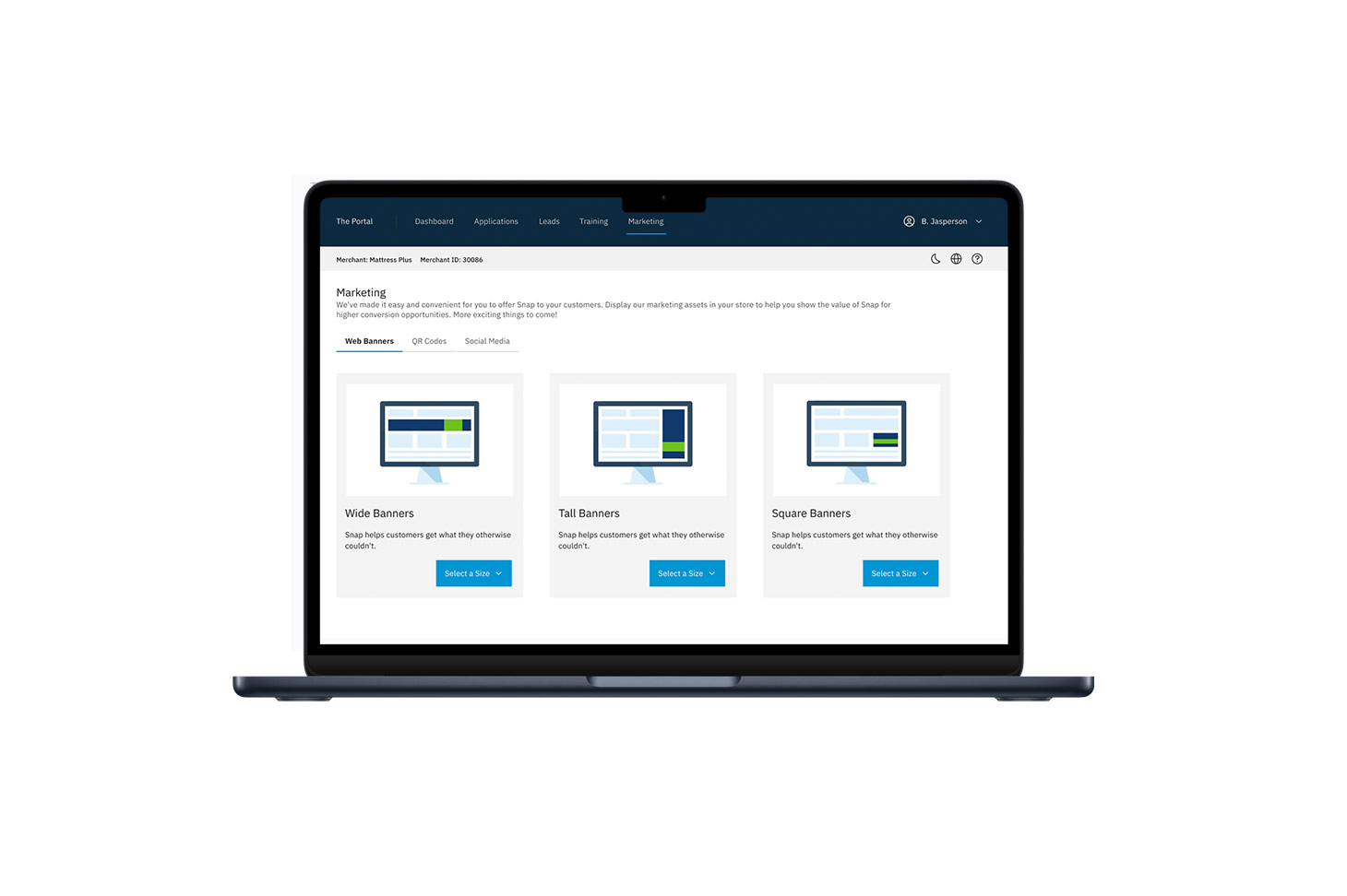
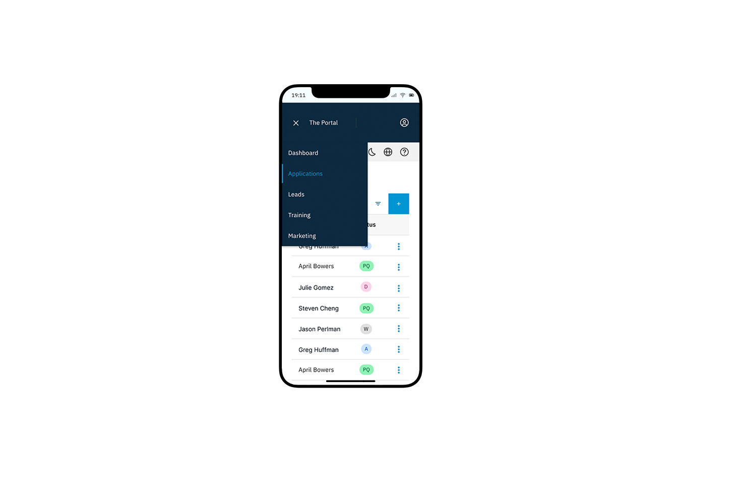
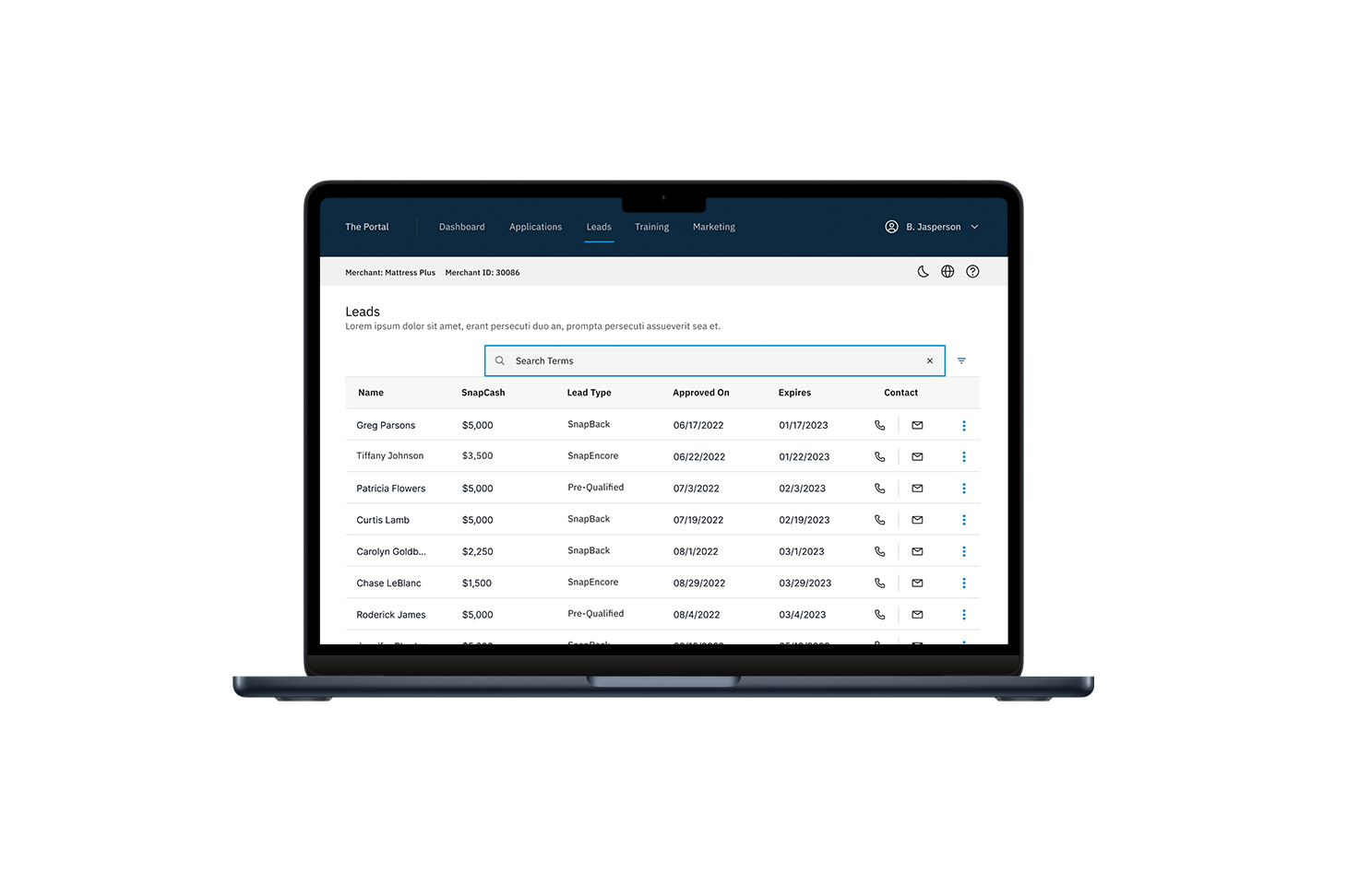
My goal with this concept was to surface high use areas of the portal while leveraging white space and scanability to quickly parse through important information. The Carbon design system was perfect as it already had a ton of base components and variables that were necessary for this initiative.
As mentioned previously, I wanted the dashboard to be the focal point of the application and the secondary and tertiary pages would follow their own pattern that was more content and utility driven.
The Result
Although they opted for a different design (which I also worked on), this was a great exploration and concept that we were able to utilize some of the ideas and concepts from for the final version that was launched.